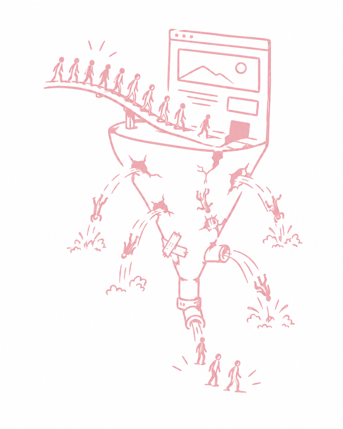
This article discusses the most common landing page mistakes that cost leads, applications, and revenue. It's not a web design textbook, but rather a practical look at conversion, trust, and clarity.
Why Landing Pages Are So Often Underestimated
Social media marketing and video ads are extremely good at generating attention these days. A landing page has to translate that attention into a decision. That's a different job.
Advertising content can be emotional, fast-paced, and intriguing. A landing page has to quickly answer: What's it about? Is it right for me? What's in it for me? What do I have to do? And can I trust you?
If these questions aren't answered within seconds, people will leave. This isn't due to a short attention span, but rather because uncertainty outweighs interest.
Mistake 1: No Clear Message Above the Fold
Many landing pages start with large images, generic headlines, or sentences that say everything and nothing. If it's not immediately clear at the top what's being offered, who it's for, and what the possible outcome is, you'll lose visitors before they even scroll.
A good landing page isn't creative in its first sentence. It's clear.
Mistake 2: Too Many Goals on One Page
A page that tries to sell, inform, collect applications, promote newsletters, and introduce the team all at once appears cluttered. The user doesn't know what to do.
Landing pages work best when they have exactly one next step. One goal. One CTA. Everything else is context that supports that goal.
Mistake 3: CTA Is Hidden or Sounds Risky
"Contact" or "Submit" aren't motivating. And if the button is buried at the bottom, you'll lose people who would take quick action.
A CTA needs to be visible, repeatable, and feel easy to take. Less risk, more clarity about what happens.
Mistake 4: No Trust, No Evidence
In Germany, trust is a crucial factor. Many landing pages make a lot of claims but show very little. No examples, no case studies, no references, no numbers, no real results.
If someone doesn't know you, they need proof. Otherwise, they're left with the feeling: Sounds good, but I have no idea if it's true.
Mistake 5: Too Much Unstructured Text
Many companies try to explain everything. The result: a wall of text. Nobody reads it.
The problem isn't text. The problem is a lack of structure. If information isn't scannable, it gets ignored. Good landing pages are like good Reels: clear blocks, clear statements, no detours.
Mistake 6: Focus on Features Instead of Result
"Full service," "modern," "individual," "tailor-made" say nothing about the benefits. Visitors want to know: What's in it for me? What's the outcome? What changes for me?
Landing pages convert when they promise a result and explain how that result is achieved, not when they simply list services.
Error 7: No objection handling
Every user has questions and objections. Is this legitimate? What does it cost? How long will it take? Is this a good fit for us? Do I have to commit long-term? What if it doesn't work?
If landing pages ignore these objections, uncertainty remains. Uncertainty kills conversions.
A short FAQ or objection block can be more effective than another pretty image.
Error 8: Poor mobile experience
Most visitors arrive via mobile devices. Nevertheless, many landing pages are difficult to use on mobile devices. Paragraphs are too long, buttons are too small, loading times are too long, and elements jump around.
Mobile isn't "also." Mobile is the standard. Those who don't impress on mobile lose the majority.
Error 9: No consistency between ad and page
If a reel conveys a clear message, but the landing page sounds different, it creates a disconnect. Disconnects erode trust.
The landing page must incorporate the logic of the content. Same language, same expectations, same direction. Otherwise, it feels like clickbait, even if it isn't intended to be.
Error 10: Form is too long or appears too early
Too many required fields increase bounce rates, especially for leads and applications.
People are willing to get in touch if it's easy. If they feel they have to invest 10 minutes before anyone even responds, they're gone.
Better: few fields, a clear statement of what happens next, and an optional second step later.
How to improve landing pages without turning them into a web project
Many believe you need a complete redesign. Often, it's enough to consistently optimize the page for conversion.
- Clear entry point.
- Clear result.
- Evidence.
- Objection handling.
- Simple CTA.
- Clean mobile design.
This isn't about design. This is about conversion. And conversion is what ultimately determines whether video ads and social media marketing actually generate leads.
Conclusion: The landing page determines whether content generates revenue
Good content attracts attention. Good ads generate clicks. The landing page determines whether these clicks lead to inquiries, applications, or sales.
If your campaigns aren't performing, it's almost always worth checking the landing page first before completely overhauling your creative and targeting. Often, that's the bottleneck that's holding everything back.
FAQ: Landing page, conversion Leads
What exactly is a landing page?
A page built for a campaign that's designed to guide visitors to a specific action, such as an inquiry, appointment, or application.
How quickly does a landing page need to convince visitors?
In just a few seconds. If it's not clear what the page is about at the top, many visitors will leave.
How important are references and evidence?
Very important, especially in Germany. Trust determines conversion.
Should a landing page contain a lot of information?
Yes, but in a structured way. Not as a wall of text, but as scannable blocks.
Why do ads and landing pages often not match?
Because the message and tone aren't consistent. This creates a disconnect and erodes trust.
Which change should be implemented first?
Organize observations according to the step at which the decision stalls. If visitors don't understand the offer, a clearer explanation might be more helpful than a new button color. If the form is unusable on a smartphone, the technical error must be fixed first.
Test the process with someone unfamiliar with the offer. Give them a specific task: "Find out if the service fits this project and show how you would submit an inquiry." Observe where they hesitate, rather than explaining the page to them during the process. Individual responses provide clues, not general conversion statistics.
Prioritizes changes based on impact, reliability of observation, and effort. Documents a change along with its expected effect. If text, target audience, offer, and form are all changed simultaneously, it's difficult to attribute a result to a single intervention.
A helpful follow-up is answering specific decision-making questions. How to structure such answers is explained in AEO. The goal is an understandable page; however, this does not guarantee a specific search result or conversion rate increase.